
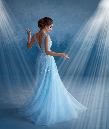
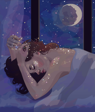
2020 is the year of the Classic Blue 19-4052 Pantone color. So, celebrating this beautiful color, we decided to show you some gorgeous jewellery that brings it with several other Pantone colours.
Furthermore, we hope they bring you good luck and strength to overcome these tough times.
The color
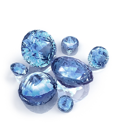
According to the Pantone website, the 2020 Classic Blue sends out a message of calmness, stability, confidence to welcome the new decade in our lives.
Surely, the beginning of it changed the world and it will continue changing it for better or for worse.
This color is not only a classic in the book, but also a reminder for people to stay humble.
If you have never heard of the Pantone Colour of The Year, it is an analysis on current trends by the Pantone Color Institute. So, each year the chosen color really sets what industries deem fashionable.
Especially to designers, the Pantone trends are super important.
So, let’s explore some Pantone color palettes that go greatly with our jewellery.
Snorkel
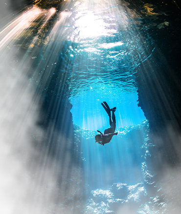
The Snorkel palette has this dreamy, colorful, tropical-like taste to it. Mostly, we really like how the blue goes together with the “Jasmine Green” color.
There are also some really good combinations with the blue color and the “Lime Punch” color.
Other jewellery examples include the 2020 color with the “Pink Tint” one.
As you can tell, these are some of our cocktail rings combinations that are truly made for the “Snorkel” Pantone palette.
We love, love, love such summery looks that bring out the scenery of cold cocktails and fun nights.
Exotic Tastes
We are dreaming about the ocean and a little vacation. So, until we reach the seaside, we will drool over the second gorgeous palette.
With the “Exotic Tastes” palette, we are leaving the sunny beaches and heading over to a calmer place. This palette takes us to warm nights filled with nature, candles, good wine, and deep conversations.
So, some of our jewellery suggestions can be from this section of our cocktail jewellery.
They are bold and filled with life, love, and gorgeous colours.
You will fall in love with them.
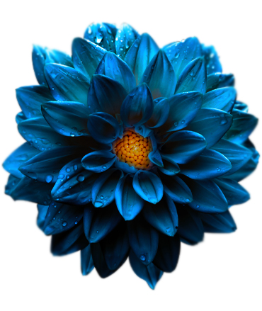
Untraditional
Bright, glimmering, Classic Blue colors that come together and explode in a palette like you have never seen before.
The harmonies go from the “Cannoli Cream” to the “Space Chery” and “Glistening Grape”.
Seriously, the colors can bring out your inner self by mixing in cream colors with shimmery deep ones.
The Red Ruby collection from the cocktail jewellery represents the “Untraditional ” palette the most accurately. We have to state that our jewellery probably does not match the Pantone colors perfectly, but it’s close.
Desert Twilight
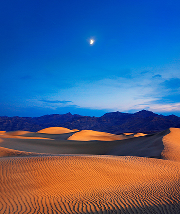
Here the amethyst stones come to life with this in the cocktail jewellery section.
How can we describe this palette: well, it’s a twilight for your collection.
You can picture the long sands covered with a veil of bluish and purple colors that intertwine with gold and silver strands.
It’s a palette to die for and if you aren’t yet convinced, then take a look at the last one.
Ponder
Rose quartz is the star of the “Ponder” palette without a doubt.
Not only is it a delicate color but it brings all of the other ones to the mix. It basically goes with everything.
So, when you’re wearing colorful clothes or additional jewellery and you want to tone it down, “Ponder” is the way to go.
In short, these were some suggestions that can bring some type of structure to your choices.If you want to see the palettes, check out this link from the official Pantone website.


Comments are closed.